4 Brand Design Tips to Improve Layout, Balance, and Hierarchy

Ever stare at a design and think, “Okay, I like the colors. The fonts are cute. The concept makes sense. So why does this still look like it’s missing... something?” and then you spend the next 40 minutes moving a star illustration around the artboard as if it’s going to reveal the meaning of life. Yeah. Been there. 🫠
Usually, the problem isn’t that you need a completely different concept, seven new fonts, or another trip to Pinterest “for research.” It’s that the composition needs a little attention. Small changes to spacing, contrast, balance, and hierarchy can take a design from almost there to ohhh, there she is. They’re the kind of details that often go unnoticed when they’re done well, but once you learn to spot them, you’ll start seeing them everywhere. On packaging. On websites. On Instagram. On the coffee shop menu that’s somehow both adorable and impossible to read.
So let’s talk about four little tweaks that can make your brand designs feel more finished, intentional, and satisfying to look at. No dramatic rebrand required. Your emotional-support decorative sticker can stay. Probably.
Why composition matters in brand design
Before we get into the actual changes, here’s the big idea: composition isn’t just about making a design look pretty. It’s about communicating with the person looking at it.
A strong composition tells your viewer:
- Where to look first.
- Where to look next.
- What information matters most.
- How different elements connect.
- What they’re supposed to do with what they’re seeing.
If your design is technically cute but feels confusing, cramped, or a little chaotic, chances are one of those visual instructions is missing. Think of it like hosting a dinner party. You can have great food, excellent music, and the world’s cutest little butter dish, but if nobody knows where to sit and three people are trapped behind the drinks table, the experience is still slightly stressful. Good composition gives everything a place and gives the viewer a reason to stick around.
1. Padding: give your design some breathing room
Padding is the space around an element, especially between the element and the edges of its container.It’s also the difference between a design that feels thoughtfully put together and one that looks like all its components got squeezed into the same Uber.
When text, buttons, images, or graphics sit too close to each other—or too close to the edges of a layout the whole thing starts to feel crowded. Even a beautiful font can look a little panicked when it’s pressed against the side of a box.
What better padding actually does
Adding breathing room helps you:
- Make text easier to read.
- Separate different groups of information.
- Show which elements belong together.
- Create a clearer visual flow.
- Make your designs feel more polished without adding anything new.
Despite the name, “white space” doesn’t have to be white. It can be cherry red, butter yellow, pistachio green, or whatever else your brand palette has going on. It’s just space that gives the important stuff room to exist.
Use a simple spacing system as a starting point, something like 8, 16, 24, or 32 pixels and apply it consistently across the layout. That doesn’t mean every single thing needs the exact same gap. In fact, spacing should help create relationships: elements that belong together can sit closer, while separate sections usually need more room between them. Also, zoom out. If your design feels like it needs to take a deep breath, it probably does.
2. Contrast: stop making every element whisper
When people hear “contrast,” they usually think light versus dark and yes, color contrast matters, especially if your text is barely visible against the background. Pale pink copy on a slightly different pale pink background might be aesthetically committed, but it’s not doing your audience any favors.
Contrast is much bigger than that.
You can create contrast using:
- Size: large headlines paired with smaller supporting text.
- Color: one brighter or deeper shade against a quieter palette.
- Typography: a bold display font paired with a clean, simple typeface.
- Weight: thick lettering next to lighter text.
- Shape: a structured layout with one unexpected organic element.
- Texture: a clean background with one grainy or illustrated detail.
- Spacing: a tightly grouped section surrounded by more open space.
Contrast creates emphasis. It tells the viewer, “Hey, this part matters.” If everything is the same size, same weight, same color, and same level of visual intensity, nothing has a reason to stand out. It’s like a group chat where everyone sends “HELLO????” at the same time. Technically, there’s plenty happening. Practically, nobody knows who to answer.
Pick one thing you want the viewer to notice first. Then ask what would help it stand apart from everything around it. Could it be larger? Bolder? Darker? Brighter? Surrounded by more open space? You don’t need all of those at once. A little contrast goes a long way and please check that people can actually read the text. We can be fun, playful, and accessible at the same time. Groundbreaking, I know.
3. Symmetry and balance: make the layout feel stable, not stiff
A balanced design doesn’t need to be perfectly symmetrical. You don’t have to center everything, mirror every illustration, or turn your brand into a very stylish government document. Balance is about distributing visual weight across the layout so one area doesn’t feel unexpectedly heavy, crowded, or disconnected from the rest.
Think about what happens when you imagine an invisible line running vertically or horizontally through the design. Does one side feel like it’s holding the entire composition together while the other side has quietly gone on vacation?
That might be a balance issue. Visual weight can come from:
- The size of an element.
- How dark or bright its color is.
- How much detail it contains.
- Where it sits in the layout.
- The amount of space surrounding it.
- Whether it’s a photo, illustration, block of text, or strong graphic shape.
A small, bright red shape can sometimes balance a much larger pale image. A bold headline on the left can be balanced by a photo on the right. Three smaller elements can counter one larger element if their combined visual weight makes sense. It doesn’t have to match. It just has to feel like it belongs. Zoom out and squint. Seriously.If the entire design feels heavy in one corner, experiment with adjusting scale, position, color, or the placement of smaller supporting elements.
4. Hierarchy: give the viewer somewhere to start
Hierarchy is the order in which information gets noticed. Or, put another way: it’s how your design politely tells someone what to look at first, second, and third.
Without a clear focal point, the viewer has to work out the layout for themselves. And if they’re scrolling Instagram, walking past a shelf, or quickly checking a website on their phone, they probably won’t bother. They’ll just keep moving. You cannot make every line the biggest line. You cannot put every sentence in a bright sticker. You cannot give the logo, headline, photo, tagline, button, star illustration, and legal disclaimer equal main-character energy.
Well. You can. But the design will be exhausting. Choose one primary focal point. Then create secondary and tertiary levels of information using size, contrast, position, spacing, and visual weight. Decorative elements are allowed to support the story. They’re not allowed to hijack it.
Good hierarchy makes your design easy to enter. It creates a natural path through the information, so the viewer understands the message without having to solve a little visual escape room.
A quick brand design checklist before you hit export
Before you send the presentation, upload the carousel, or put the final mockup into your portfolio, ask:
- Padding: Does everything have enough breathing room?
- Contrast: Can I immediately identify what stands out?
- Balance: Does the layout feel visually stable across the whole composition?
- Hierarchy: Do I know where to look first, next, and last?
If the answer to one of those questions is “ummm, kind of?” that’s usually your sign to make a few small adjustments. Move the button down. Give the headline more room. Make the secondary text smaller. Shift the illustration to the other side. Let the important thing be important.
Tiny changes. Big difference. Very satisfying.
Want to get better at brand design without guessing your way through it?
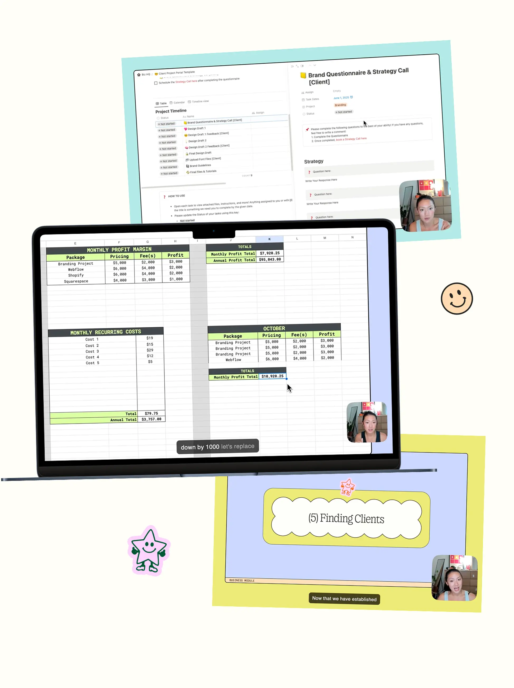
These four tweaks are only part of the bigger picture. Inside Camp Evergreen, we get into the actual why behind strong brand design from composition and layout to typography, color, strategy, brand identity, web design, and building a creative business that works for you.
You’ll learn how these principles show up in real client projects, practice them through design briefs, and start making intentional choices instead of staring at your artboard thinking, “I know this is almost good, but what am I supposed to do now?”
Camp Evergreen is self-paced, so you can work through the lessons whenever it makes sense for you. You’ll also get access to practice briefs, resources, the camp community, and mentorship calls for those moments when you need an actual human to tell you why the layout feels a little funky. Basically: design school energy, but more fun, more useful, and significantly less likely to involve someone telling you your work is “interesting” in a way that ruins your entire week.
Ready to stop guessing and start designing with intention? Explore Camp Evergreen and become a brand designer the fun way. ⛺
Love, xx
Alyssa 🤠