Casa Bele

Casa Bele is an Argentinian brand design studio with a special love for crafting connections and designing for brands with impact. For this project, we focused on designing a brand system that would communicate the intimacy and personal connection that the studio embodies. For this, we used a mixture of editorial and minimal design elements with warm tones, nostalgic photography, and hand-drawn illustrations.

Brand Design

Creative Direction:

Design:

Alyssa Nguyen

Copy:

Web Development:

Client:

Belen Ladaga

(01) Creative Direction Concept

The creative direction blends nostalgic charm with modern sophistication, combining vibrant 70’s-inspired hues, experimental yet refined typography, and a balance of sharp and organic shapes to create a friendly, approachable aesthetic. Photography adds a nostalgic yet chic touch, tying the design together with an elevated and timeless feel.

(02) color palette

We developed a color palette inspired by 70’s hues but infused with more saturation and energy to bring vibrancy to the design.

(03) type suite

We chose typography that is both classically modern and experimental to balance sophistication with creativity. The use of serifs, sans serifs, and display serifs adds a touch of modernity without leaning too simple.

No items found.
(04) LOGO SUITE

We designed the logotype to reflect the inspiration drawn from the concept moodboard, blending raw, handwritten letters with classic serifs and sans serifs for a dynamic and balanced look. The inclusion of “SA” and “BE” cleverly spells out “Sabe” in Spanish, adding a playful, meaningful detail. The logomark features an asymmetrical flower with an orange center, capturing the whimsical yet elegant essence of the studio’s designs.

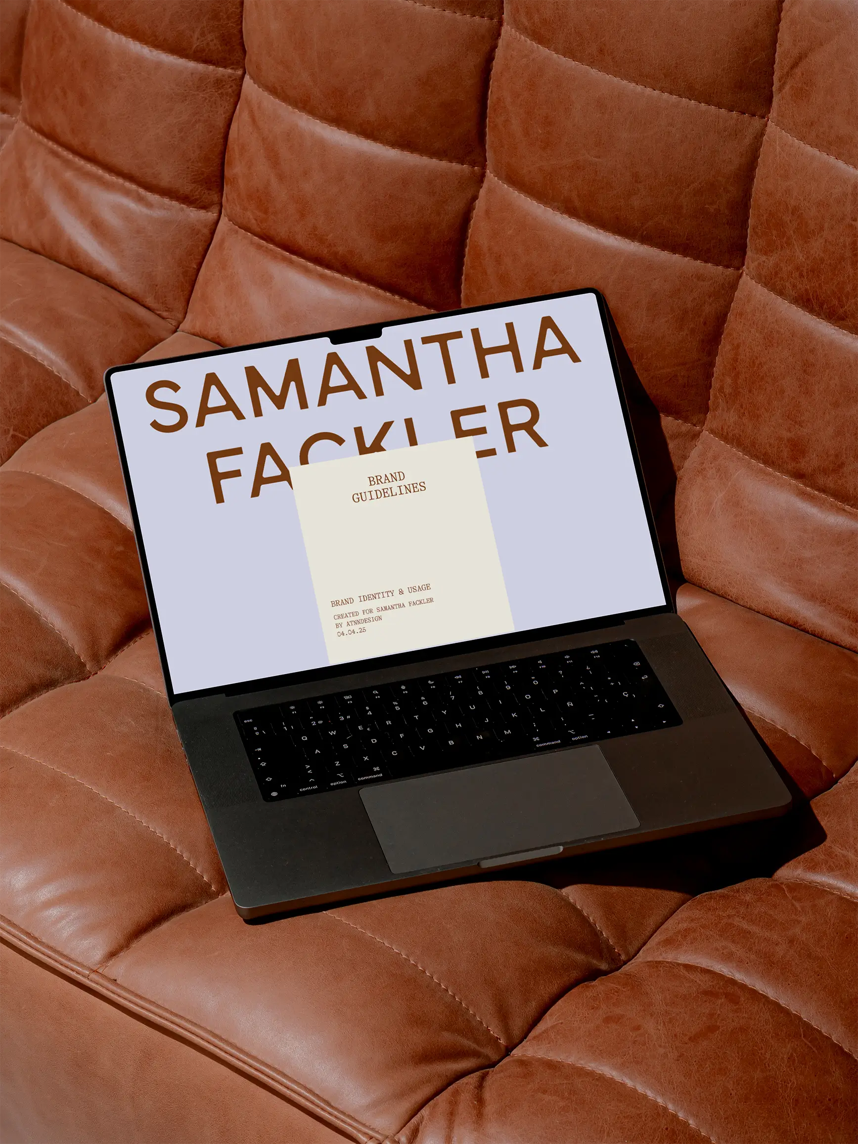
(05) BRAND GUIDELINES
(06) WEB DESIGN (scroll to view)

We created a sample hero website design to showcase how the brand’s whimsical yet professional identity could be brought to life online. The design integrates playful typography, vibrant colors, and organic shapes, balanced with clean layouts and sophisticated imagery, to create a welcoming and polished digital experience. This approach highlights the brand’s unique blend of creativity and elegance, setting the tone for a cohesive and engaging user journey.

(07) BRAND ELEMENTS
No items found.
(08) BRAND COLLATERAL

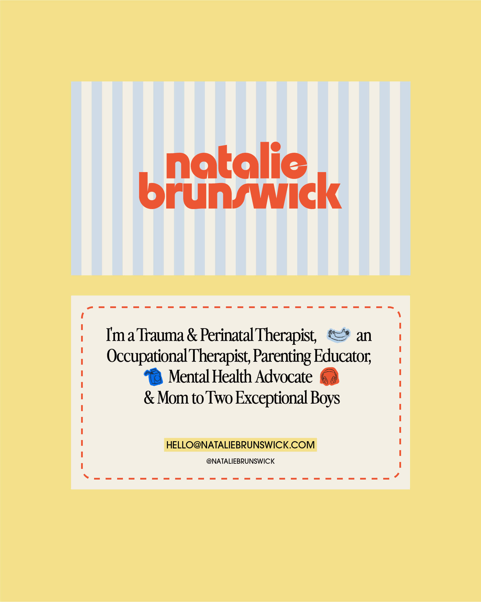
We designed a range of collateral, including a billboard, business cards, a tote bag, and a digital ad, to demonstrate how the brand translates seamlessly across various mediums. Each piece highlights the consistent use of key elements like colors, logos, and typography, ensuring the brand's whimsical yet professional essence is maintained in both physical and digital applications. This showcases the versatility and cohesion of the brand across diverse touchpoints.

No items found.
No items found.

View more projects