A Guide to Your Brand's Color Palette: How to Understand & Use It!

So, you've got this fresh set of brand colors, and now you're staring at them, thinking, “What do I do with these?” Don't worry; I’ve got you covered. Whether you're a DIY brand enthusiast or just trying to understand what your designer handed over. This blog will help you make the most of your palette and ensure that your brand colors are working for you, not against you.
Understanding Your Color Palette: The Basics
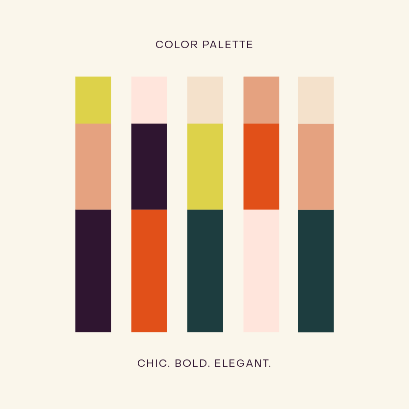
Your color palette isn’t just a random selection of pretty colors. Each one has a purpose, and when used right, they work together like magic. Here's what you need to know:

Background Colors
These are the foundation of your design, that makes sure everything else pops. They’re usually subtle and understated, making your content easy to read. For example, when we worked with Leap Periods, we chose a cream / cotton color for their background color. It created a clean canvas that allowed the vibrant, signature pop of orange to really shine. Not sure what your background color(s) is? It’s probably the lightest shade(s) in your palette like a white, gray, or pastel.
Text Colors
Text colors need to stand out against your background colors, ensuring everything is super legible. It should be bold enough to catch your eye but doesn’t overpower the softer background colors. Remember, if your text isn’t readable, it doesn’t matter how pretty your palette is, no one’s going to stick around to admire it! Not sure what your text color is? It’s probably the darkest color in your palette.

Main Colors
These are your brand’s “it” colors, the ones everyone will associate with your brand. They’re front and center in all your designs. For example, when we developed the brand for our client, Wild Stems, we went with a vibrant orange and bright blue and as the main colors. They’re bold, fresh, and perfectly encapsulate the funky-cool vibe they wanted to convey. Not sure what your main colors are? It’s probably the color that is most prominent and often used in your example designs.
Accent Colors
Accent colors are like the finishing touches that make your design pop. They support your main colors without stealing the spotlight. The accent colors add just the right amount of contrast, making the design feel complete and cohesive. Typically, accent colors are used for things like stickers, accents, icons, patterns, etc. and are usually indicated by how they’re used! Not sure what your accent colors are? They’re probably used with the main colors in sample designs.
Decoding Your Brand Guidelines
Now that you know what each color in your palette is supposed to do, let’s talk about how to actually use them. Your brand guidelines are there to help, but if they’re feeling a bit like a foreign language, here’s a quick translation:
Hex Codes: These are six-digit codes like #F18F47 that represents your specific brand colors. They’re your go-to for keeping colors consistent across different platforms. We always recommend keeping these codes saved somewhere handy, like in your notes app or directly in your design software, so you can easily grab them when you need them.
CMYK: This is what you’ll use for print materials. Think business cards, brochures, or packaging. When you create packaging design, you’ll rely on CMYK codes to ensure the colors look just as stunning in print as they did on the screen.
RGB: This is all about digital. It’s another way to represent colors, specifically for screens, making sure the colors look vibrant and true-to-brand on all devices.
*Pro Tip: Stick to using hex codes for most of your online needs, it’s the easiest and most universally recognized format. If you’re ever unsure, just check the guidelines your designer provided. We at ATNN Design always include a simplified brand style guide, which is like a cheat sheet for all your brand elements.
How to Use Your Colors Without Overthinking It
Okay, so you’ve got your palette, and you know what everything means. Now, how do you actually apply it without feeling overwhelmed?
Follow the Usage Guidelines
Your designer should have provided some specific pairings or rules for how to use your colors together. If not, take a peek at any mockups or sample designs they’ve given you.
Test for Legibility
Don’t just assume your colors will look good together, test them out! Place your text over your background colors and make sure it’s easy to read. We always do this at ATNN Design Studio to ensure our designs are as functional as they are beautiful. If something looks off, don’t be afraid to tweak it. Your brand’s readability is key to keeping your audience engaged.
Assign Colors to Specific Applications
One trick to simplify your life is to assign certain colors to specific uses. For example, maybe your main color is reserved for headlines, while your accent colors are used for call-to-action buttons. This approach not only helps with brand recognition but also makes your design process more straightforward, creating a consistent look that is easy to implement across different platforms.
Wrapping It Up: Making Your Brand Colors Work for You
If you’re a designer, feel free to check out the brand style guide or brand guidelines we offer our clients at ATNN Design Studio. These can be fantastic templates for your own projects, giving you a solid foundation to build on.
And if you’re in the market for a brand designer who won’t just hand you a pretty logo and call it a day, you’re in the right place. At ATNN Design, we make sure you walk away with a brand you love AND can actually use. All our clients receive comprehensive brand guidelines or style guides after their branding project. These guides provide clear instructions and tips for using all your brand elements, not just color, but also your logos, typography, illustrations, patterns, and photos.
We know how frustrating it can be to invest in a gorgeous brand, only to have it dropped into your hands without any directions. That’s not how we roll. We’re here to make sure you feel confident and empowered to use your brand across every platform.
I hope this was helpful and if you have any questions or are interested in potentially working with us, shoot us an email or head to our project inquiry page.
Love,
Alyssa xx